Mobile-First Web Development: What San Diego Businesses Need to Know in 2024
Mobile-first design reflects the current state of the world. Chances are a large percentage of visits to your site come from mobile devices. While you don’t want to leave out desktop users, they might not represent much of the local San Diego market. Use discrete flexible HTML if at all possible, which loads equally well on all devices.
Since this might not be possible, responsive designs are the next best thing. A reliable SEO company in San Diego such as Saba SEO can help business owners optimize their websites with mobile-first design.
Making Your Service Respond to Input
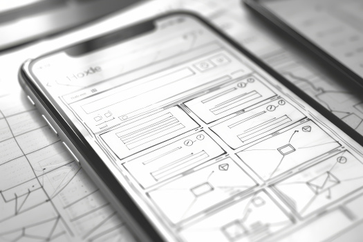
Make sure the page reflows as users change the viewport, because different devices have different resolutions. Try using a wireframe prototype before you start copying content in. So-called “hamburger menus” are generally useful but don’t hide everything beneath them.
If you’re lucky enough to be working on a site from scratch, such as one for a local small business, try building it around these design features:
- Use negative space to create an interface free of distractions
- Put all the most important information on the first page
- Never use hover items or tooltips, since these are hard to work with on a phone
- Organize images so you don’t end up with awkward spaces on smaller devices
- Make fonts big enough to read
Unless you’ve spent a lot of time working with old-school desktop publishing software, you’ll want to give that last item a little extra thought.
A Word about Typography
Design guidelines from Apple recommend never using a font smaller than 44px when working in a mobile-first design paradigm. Even the most liberal estimates have claimed you shouldn’t use anything smaller than 30px no matter how limited you are on space. Consider offering separate little dialog screens every time you have to ask the user a question. Desktop and laptop users might not prefer this, but those who do everything through a mobile device will appreciate it.
Avoid fancy serif typefaces as well. These can look gorgeous on the right kind of screen, but they’ll often prove hard to read on tiny screens.
Mobile-first web development isn’t the only factor that matters to rank a website on Google. If you need help with PPC campaigns, website development, or mobile SEO, contact Saba SEO, a premier web design company in San Diego. To speak at length with one of our marketing experts, give Saba SEO a call today.